
Well fellow DM’s it’s here it’s finally here, for some of us. Others are going to have to wait another two weeks. But if you are like me and now have the DM screen in your hands the wait is over. I know it is only a DM screen. But in so many ways it is more than that. If it is put together well the DM screen is the go to tool for a DM.
Earlier this year I said that I did not like Gale Force 9s DM screen. I thought it was weak and conditioned a lot of wasted space that we would find little to no use for after the Horde of the Dragon Queen story was over.
So did WOTC get it right?

Well, let’s start off with WOW. that’s one of the best DM screen pieces of art in a good long time!
So that said what about the tables. Like I said I was hard on GF9 for their tables. So here we go. We got your standard 4-panel screen and its landscaped TY. I have become such a fan of Landscape DM screens. They make my life as a GM easier. I can see my awesome Dwarven Forge at my table without having to stand up to look over the screen. As well as my players can see more than just my eyes peering over at them from behind the paper wall.
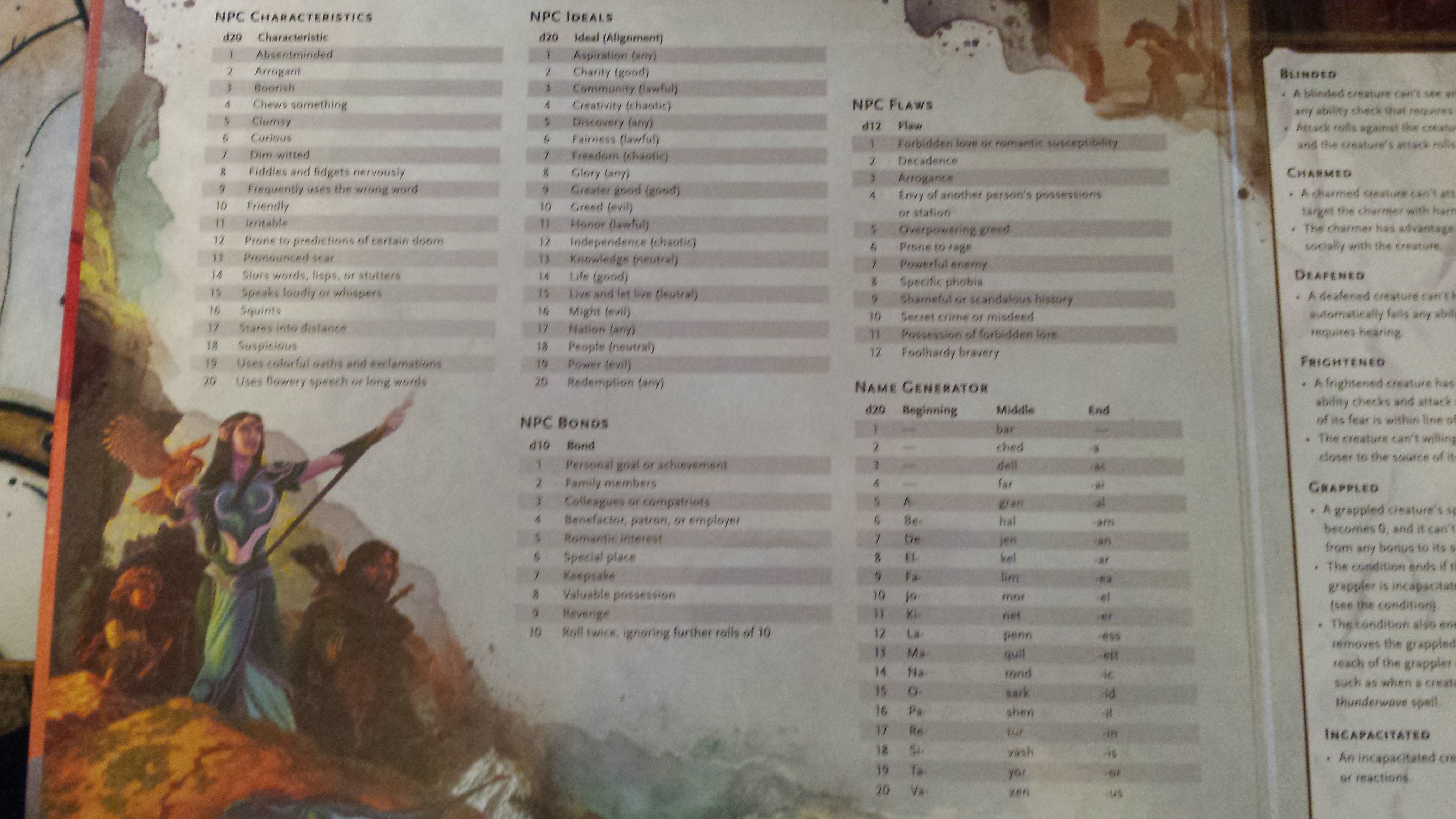
Now, the first panel on the left I was a bit unhappy with when I first saw it. But then over the next hour It sunk in for me. And I think this might be the single best panel in the DM screen to date. How often to I look around the game room looking for inspiration for names or mannerisms at the table on the fly for that random NPC. And now. I only need to look to my left! The left-hand tables also have Characteristics, Ideals, Bonds and Flaws. Going back to my blog about Pixar’s TED talks this is awesome. Motivations and Flaws are what makes NPC’s seem real.
Any GM knows that your players will always latch on to that random NPC you made up on the fly. So you now have some tools to help you round him out on the fly. I cant say enough good things about this table. Mostly because in my game last week a now Major NPC came to the forefront because of these tables. And because of this, we enjoyed nearly an hour of roleplay just from the personality that was rolled with the chart and the interactions with the party that came from them. My players were none the wiser that I had created him off the cuff.
The center panels deal with.
Conditions, cover, obscured areas, light, setting a DC and skills and associated abilities.


Well, where to start. Conditions dominate these two panels. I am really glad they are there. It is something that will be referenced regularly in games. But I wish they would have used the space a bit better and found a way to make conditions only take up one panel and not one and a half. This would have saved some space and given room for more DM content.
Had they cut the art and reduced the space they would have allowed for nearly an entire additional panel of information to be put on the screen. As nearly everything in the last panel would fit on the panel there.
As to the other half of the third panel, all very useful info and I am glad to see it there.
The last panel contains.
Travel pace, encounter distance, damage by level and severity, something happens! Quick finds.
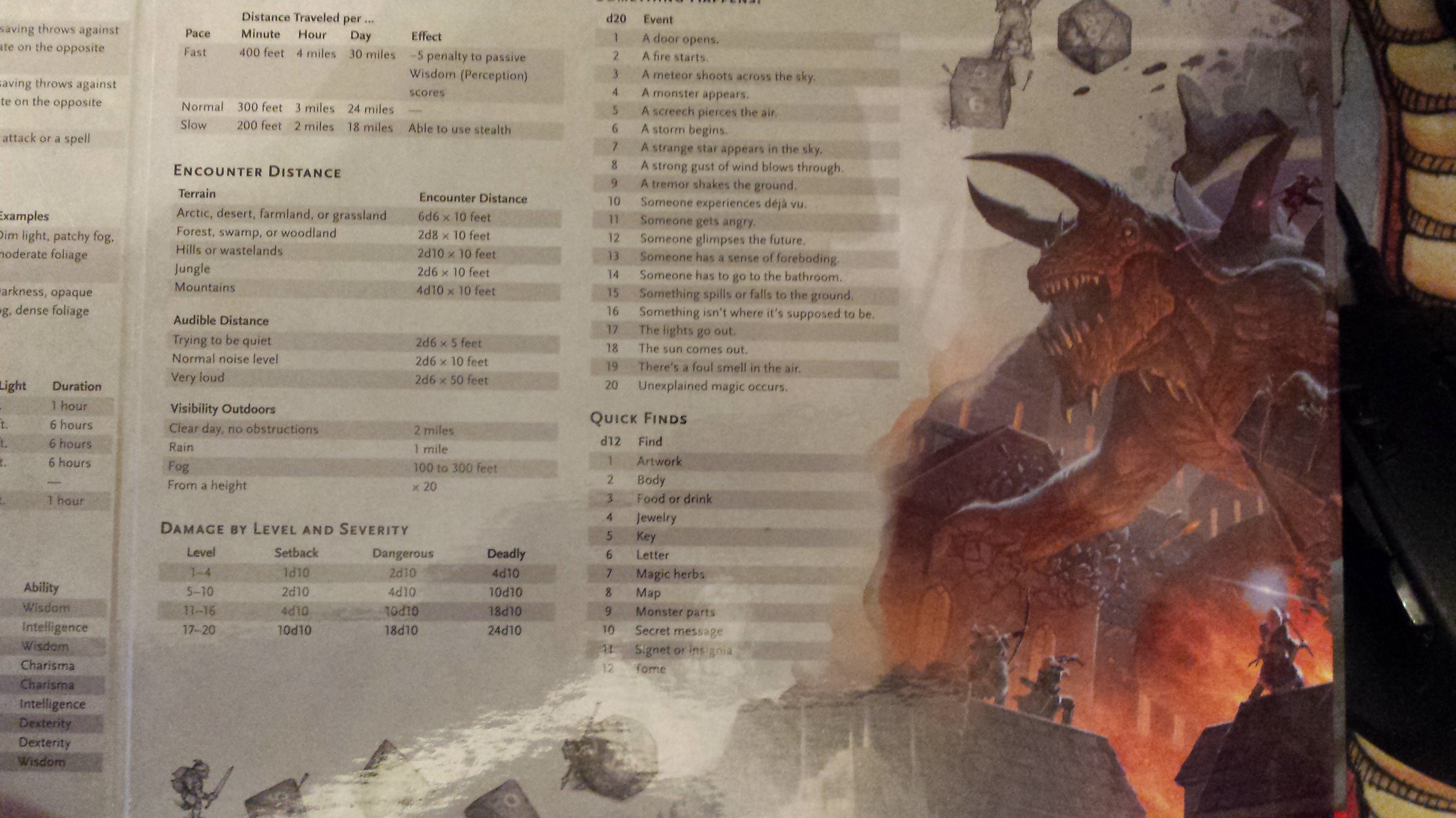
Mostly useful stuff here and I like most of what they have put here. My only issues with this. Two fold. If they would have moved the conditions to one panel all of this would have fit on the third panel. And the larger piece of art here as nice as it is. Is nothing more than wasted landscape. We could have had a third column of info. Now I know I am being picky. But come on WOTC! I want my major art on the Back of the DM screen and my tables on the front so I can maximize its use!
Now I love the Dice and the goblins running around behind them. Its reminiscent of the 1st edition DMG! I wanted more of that on my GM screen, not the Tarasque blasting through the right side of my screen gobbling up table space.
So if I had the whole spare Panel left on my DM Screen what would I put there? Likely the random settlement section of the DMG including tavern name Generator off the top of my head. Or maybe the Adventure goals & Introductions charts from chapter 3 or side quests table. You know things I could have used.
SO in my normal review fashion.
Pros:
It is beautiful, it is also laid out in landscape and has some great tables that you will find yourself using often as a DM.
Cons:
As noted above I feel that they could have used space better in the product. I think if they had cut back just a bit on the bigger art on the DM side and stuck with more in the style of the goblins and the dice. The could have achieved the same goal and had at least three more columns of tables for the Dungeon Master.
Would Recommend buying it?
My biggest complaint is that it hits the mark of why you have a DM Screen. The DM screen is there to block the view of what is going on at your end of the table. In this is does that wonderfully as it is pretty to look at. On the other side of the screen, it should convey as many quick reference rules and need to know info that it can in an organized manner to keep you from having to look in the books for answers. The whole right side of the Screen is overall a waste of space and far too much landscape is sacrificed for artwork. So yeah I give it a 8. I would recommend it to most DM’s
Update. After really letting it sink in and looking the tables over a good bit. I have to adjust my 8 to a 6. there is just too much wasted space and the tables on the left-hand panel are just meh.

Where Can I Buy it ?
You can follow this link HERE to pick up a copy.


